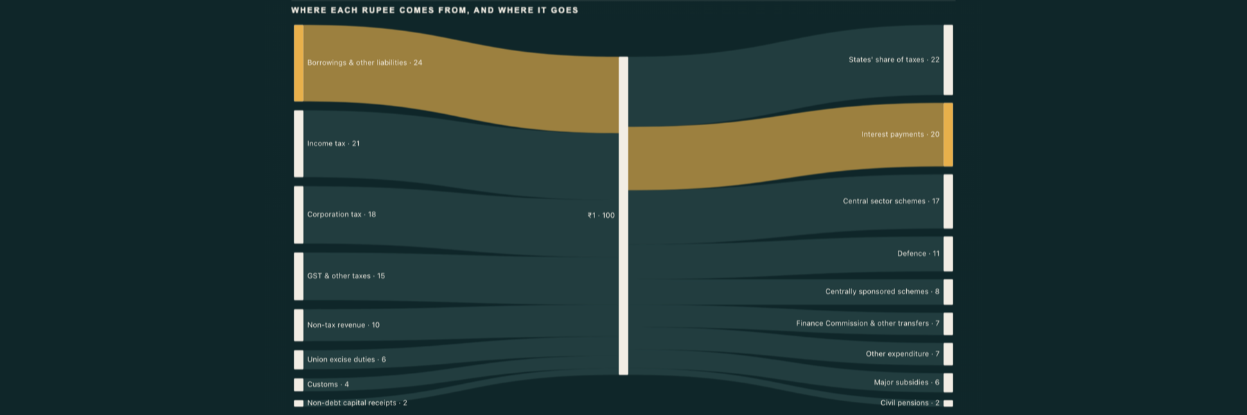
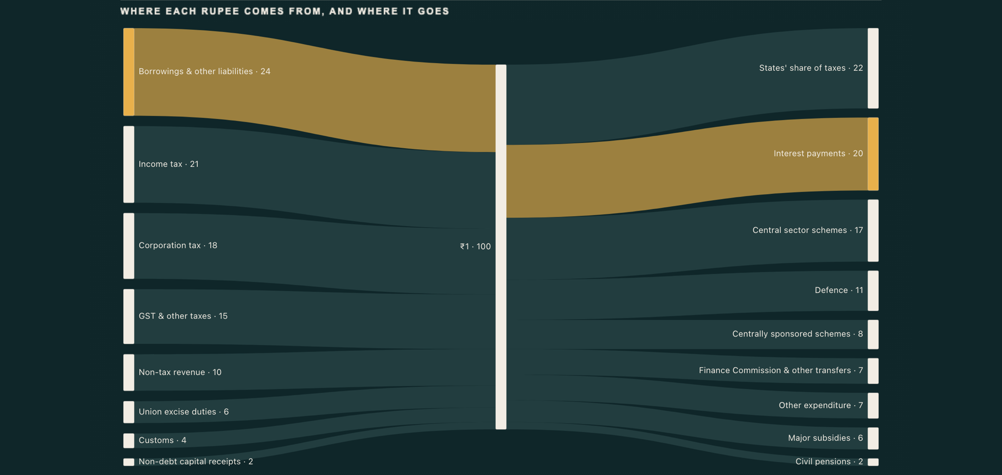
In India's Union Budget for 2026-27, 24 paise of every rupee comes from borrowings and other liabilities. That's more than any single tax: income tax brings in 21 paise and corporation tax 18. On the spending side, 20 paise of every rupee goes on interest payments, the second-biggest use after the states' share of taxes (22 paise) and almost double defence (11 paise).
The Budget publishes these as two separate breakdowns, "rupee comes from" and "rupee goes to". Each one is easy to read on its own. What two separate charts can't show is the same rupee coming in on one side and going out on the other. A Sankey chart can, so we rebuilt the breakdown as one page in Power BI.
The numbers
All figures are paise per rupee for 2026-27, as reported on 1 February 2026. Each side adds up to exactly 100.
| Comes from | Paise | Goes to | Paise |
|---|---|---|---|
| Borrowings & other liabilities | 24 | States' share of taxes | 22 |
| Income tax | 21 | Interest payments | 20 |
| Corporation tax | 18 | Central sector schemes | 17 |
| GST & other taxes | 15 | Defence | 11 |
| Non-tax revenue | 10 | Centrally sponsored schemes | 8 |
| Union excise duties | 6 | Finance Commission & other transfers | 7 |
| Customs | 4 | Other expenditure | 7 |
| Non-debt capital receipts | 2 | Major subsidies | 6 |
| Civil pensions | 2 |
Taxes together (income, corporation, GST, excise and customs) bring in 64 paise. We haven't compared these with 2025-26: the sources we checked disagree on some of last year's lines, so we left it out rather than guess.
Shaping the data: one table, three columns
A Sankey needs links: where something starts, where it ends, and how much moves. The trick for a "comes from / goes to" breakdown is a node in the middle that both sides connect to. Here that node is simply called ₹1.
- 8 rows go into the middle:
Income tax → ₹1 → 21,Customs → ₹1 → 4, and so on. - 9 rows go out of it:
₹1 → Defence → 11,₹1 → Interest payments → 20, and so on.
That's the whole model: one table with From, To and Paise, 17 rows. Bind From to Source, To to Destination and Paise to Value, and the diagram draws itself, with the middle node sized at 100. If you're building something similar, check that both sides add up to the same total before you start. If they don't, the middle node won't balance and the chart will look wrong for a reason that has nothing to do with the visual.
The same shape works for any "where does the money go" breakdown: a household budget, a company P&L, a grant, a project's funding.
Making one path stand out
With 17 flows, a fully coloured Sankey turns into a rainbow and nobody knows where to look. We wanted the reader's eye to go straight to one story, borrowings in and interest out, so everything else is a single dark colour and only that path is gold.
In Zentrix Sankey Pro this is done with conditional formatting rules rather than by picking colours node by node:
- A link rule: source name is "Borrowings & other liabilities" → gold.
- A link rule: destination name is "Interest payments" → gold.
- Two node rules with the same names, so the bars at each end match their ribbons.
Because the rules match on names, the colour stays on the right path if the numbers change or the nodes reorder. Nodes are sorted by value, so the largest source sits at the top left and the largest use at the top right. The order doesn't depend on how Power BI happens to return the rows.
The colours themselves were checked for contrast, not chosen by eye. The gold differs from the teal flows in lightness as well as hue, so the highlighted path still reads for people with colour-vision deficiency, which is a common way for a "highlight one thing" chart to fail.
Why a poster and not a dashboard
The full page treats the budget like a newspaper page rather than a dashboard: a headline that states the finding, a short standfirst, the Sankey as the main picture, and two ranked bar charts underneath for anyone who wants the exact order. There are no card borders, and Power BI's built-in visuals sit directly on the page background.
That's a deliberate choice, and it follows what we're seeing in the Power BI community right now. Many entries in this month's Microsoft Fabric Community contest are A4 portrait posters with editorial headlines, and the round-one winner of the 2026 Power BI DataViz World Championships, which the judges praised for its colour and layout consistency, is described by its author as deliberately restrained: a monochrome palette, plenty of whitespace, and custom visuals used only where they add something. For a single number-heavy story like a budget, a page you read top to bottom works better than a grid of tiles.
Two practical notes if you want to try the poster style in Power BI:
- Put the static parts (masthead, rules, section labels, source line) in a page background image, and keep every number in a real visual. The numbers stay live and the design stays sharp.
- Turn off visual backgrounds and borders in the theme, so the charts sit on the page instead of in boxes.
Reading the result
Three things the flow makes obvious that two separate charts don't:
- Borrowing is the single largest way the rupee arrives, bigger than any one tax.
- Interest is the second-largest way it leaves, behind only the states' share of central taxes.
- The ribbon widths make those two comparable at a glance: 24 paise in from borrowing, 20 paise out on interest.
The chart doesn't explain why, and we haven't tried to. It shows the shape of the budget, and the explaining belongs to economists.