Zentrix Org Chart
1,240 people, and you can still read it.
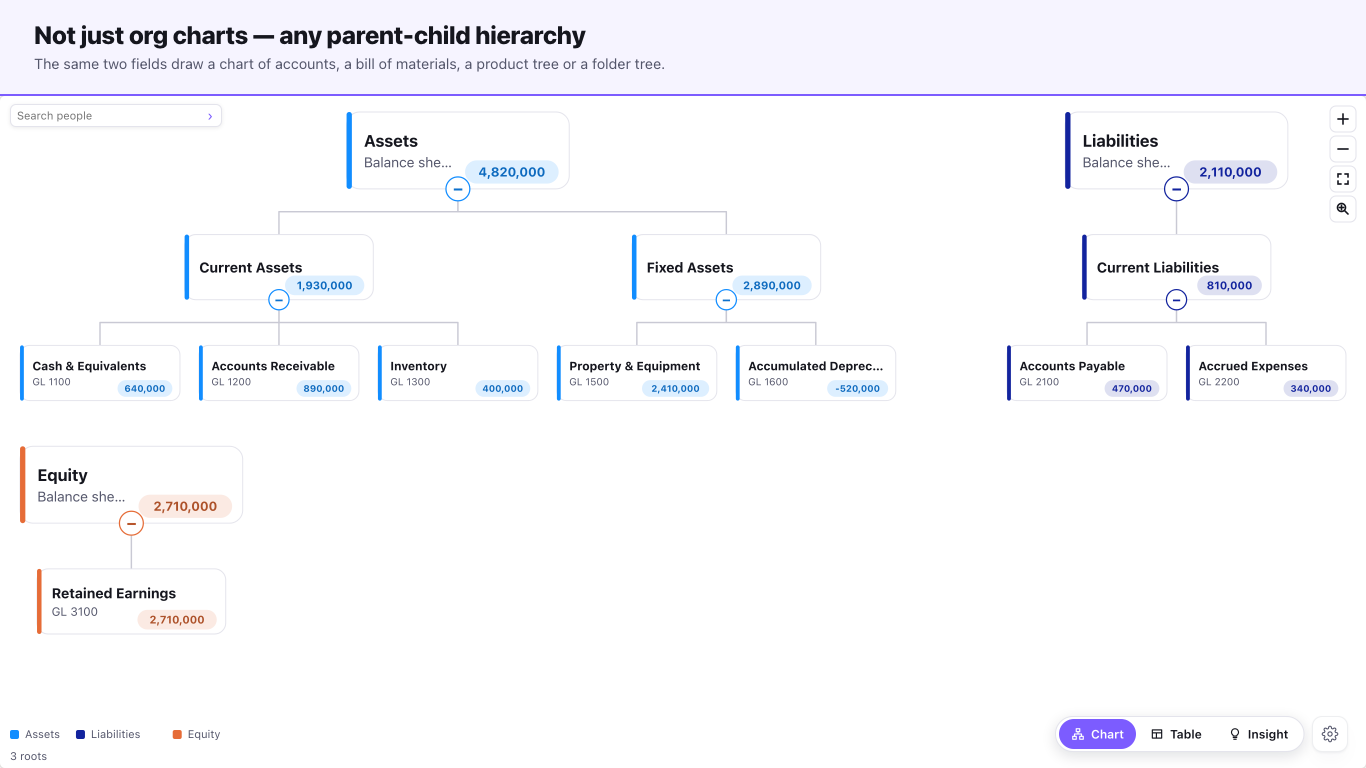
A hierarchy visual, not an HR visual. Give it an ID and the ID it reports to, and the same two fields draw an org chart, a chart of accounts, a bill of materials, a product hierarchy, a legal-entity structure or a folder tree. Big trees open folded to a size you can actually read, each folded branch carrying its count, and a lens, a minimap and search-and-jump get you to one person without losing the shape of the whole. Everything is computed inside the Power BI sandbox.
- Fields needed
- Two — an ID and the ID it reports to
- Also takes
- Name, title, photo, group, a measure, a period label
- Scale
- 30,000 rows; no node cap at any tier
- Price
- Free, permanently — every feature, no paid tier
- Accessibility
- Keyboard focus, table view, CSV export
- Privacy
- No external calls, no telemetry
See it in action
A quick look at the
Org Chart
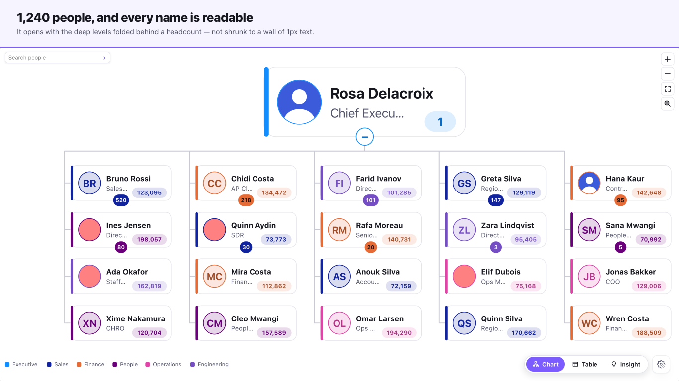
1,240 people in one Power BI org chart — and you can still read it
Features
Built to surface
what matters
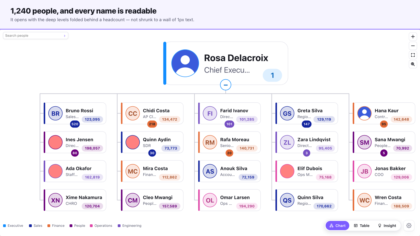
Big hierarchies stay readable
It picks an opening view around an 11px name size rather than shrinking everything to fit, folding branches and labelling each one with its count. On the 1,240-person test fixture at 1340×620 that opens as 21 cards with 14.7px names. Two explicit fits sit behind it: the largest view that keeps every name legible, and one that shows the whole chart whatever that costs.
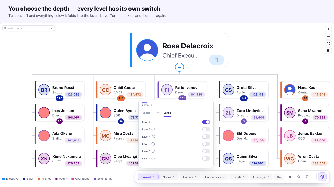
One switch per level
Ten per-level switches, from level 2 down to level 11, behaving as a ladder — turn one off and everything deeper goes with it. Roots are always drawn. It is how you show the top three layers to a board and the whole tree to a manager, from the same visual.
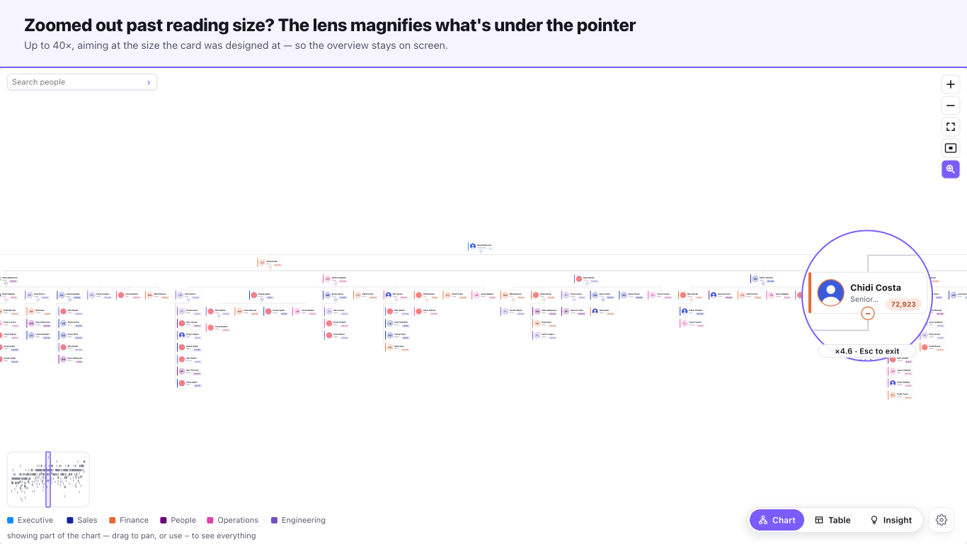
A lens, a minimap and search
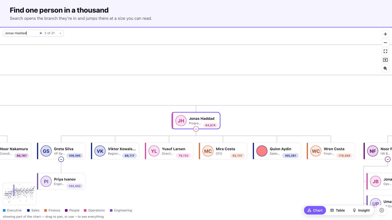
A magnifying loupe reads whatever is under the pointer while the chart stays zoomed out. A minimap thumbnail with a draggable window shows where you are. Search finds a person, opens their branch and jumps there at a readable size.
It does not break on real data
Blank, missing, dangling and self-referencing roots all render. Collapse is remembered by key, not by row position, so a refresh doesn't reshuffle what you folded. Forty siblings under one manager never overlap. Reporting cycles become roots instead of hanging the visual — the walk is iterative, never recursive.
Three ways to read it
The chart, a sortable table with CSV export, and a plain-English summary. The view switch works for report readers, not just authors. Underneath, it computes span of control, layer counts, roll-ups and vacancy flags, and can compare two snapshots to show joiners, leavers and movers.
Dotted lines, without a second parent
Matrix and dotted-line reporting draw as extra edges rather than corrupting the tree into something with two parents. Photos are embedded data only, never fetched, so nothing leaves your tenant.
Screenshots
The real thing,
not a mock-up
Every image below is a capture of the shipping Org Chart. Where a shot needs a paid plan, its caption says so.
The Insight Engine
Insights that never
leave your tenant
The Org Chart computes its insights with transparent, deterministic logic — entirely inside the Power BI sandbox. No external calls, no telemetry, nothing leaves your tenant.
- Span of control — who carries too many or too few reports
- Layer counts and where the tree gets deep
- Roll-ups of your measure by branch
- Vacancy flags in the reporting line
- Joiners, leavers and movers between two snapshots
Runs in the Power BI sandbox
Every insight is computed inside the Power BI visual sandbox. The visual makes no external network calls and sends no telemetry — nothing about your data leaves your tenant.
Free to use
Free, fast to install, and yours to keep
The core Org Chart is free — no trial, no watermark, no sign-in. Add it from AppSource, drop it on your canvas, and you're running. Full setup steps live in the docs.
Read the getting-started docsFree, and staying free. If the Org Chart earned its place on your report, you can support the work: