Zentrix Network Graph
See how everything connects — and which nodes hold it together.
A relationship and network graph for Power BI. Plot any source→target relationships across a deterministic force-directed layout that lands in the same place on every refresh, light up neighbourhoods on hover, and read the network as a sortable metrics table — all free. Pro adds the centrality maths and the plain-English insight read-out; Enterprise adds clustering, path analysis and uncapped scale. Everything computes inside the Power BI sandbox, with no external calls.
- Data roles
- Source + Target required; 11 optional
- Layouts
- 5 free (force, concentric, circular, grid, tree) + Geo on Enterprise
- Scale
- 500 nodes / 2,000 edges free · 2,000 / 5,000 Pro · uncapped Enterprise
- Pricing
- Free forever · Pro from $24.99/yr · Enterprise from $54.99/yr
- Accessibility
- Keyboard nav, focus ring, CVD-safe, high contrast
- Privacy
- No external calls, no telemetry
See it in action
Watch the
Network Graph
Zentrix Network Graph — centrality in Power BI: degree, betweenness and PageRank
Zentrix Network Graph — community detection and shortest path in Power BI
Features
Built to surface
what matters
Deterministic force layout
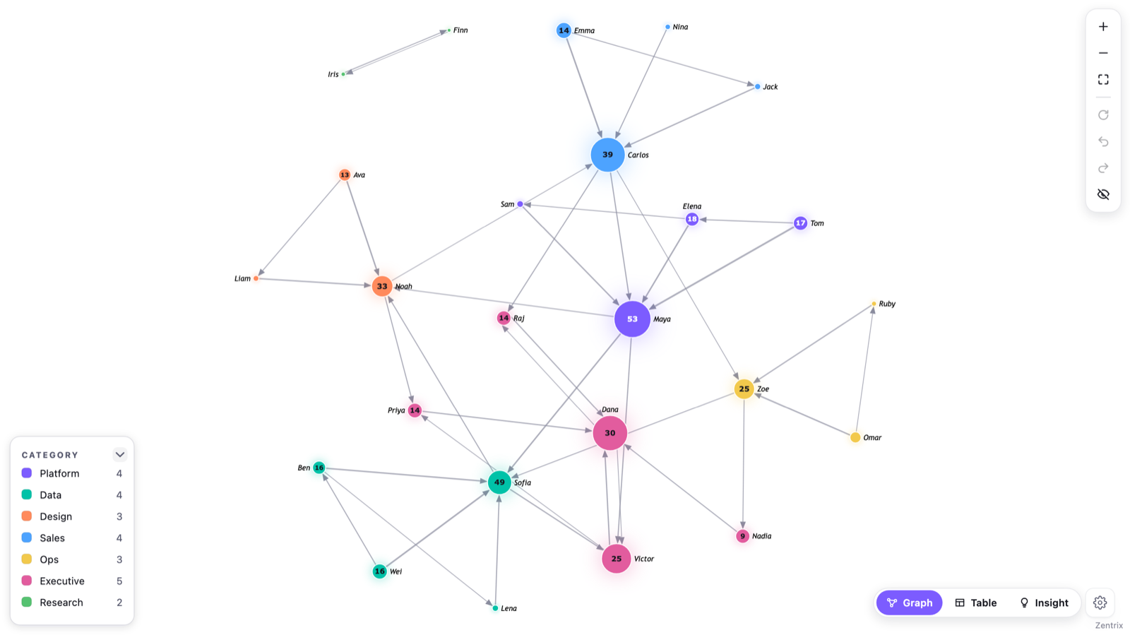
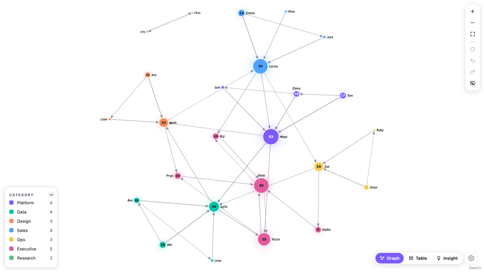
A seeded, deterministic force-directed layout places every node the same way for the same data — no more “my graph moved” on refresh. There is no random seed and no wall clock anywhere in the layout path. Pin layout, on Pro, freezes an arrangement into the report so later renders replay it and skip the simulation entirely.
Neighbourhoods & exploration
Free + EnterpriseHover a node to lift it and its neighbours and dim everything else, drag to hand-arrange, lasso-select a region — all free. Explore mode walks outward from one node hop by hop, and path analysis traces the shortest route between any two nodes, optionally weighted by edge value; both are Enterprise.
Communities & clustering
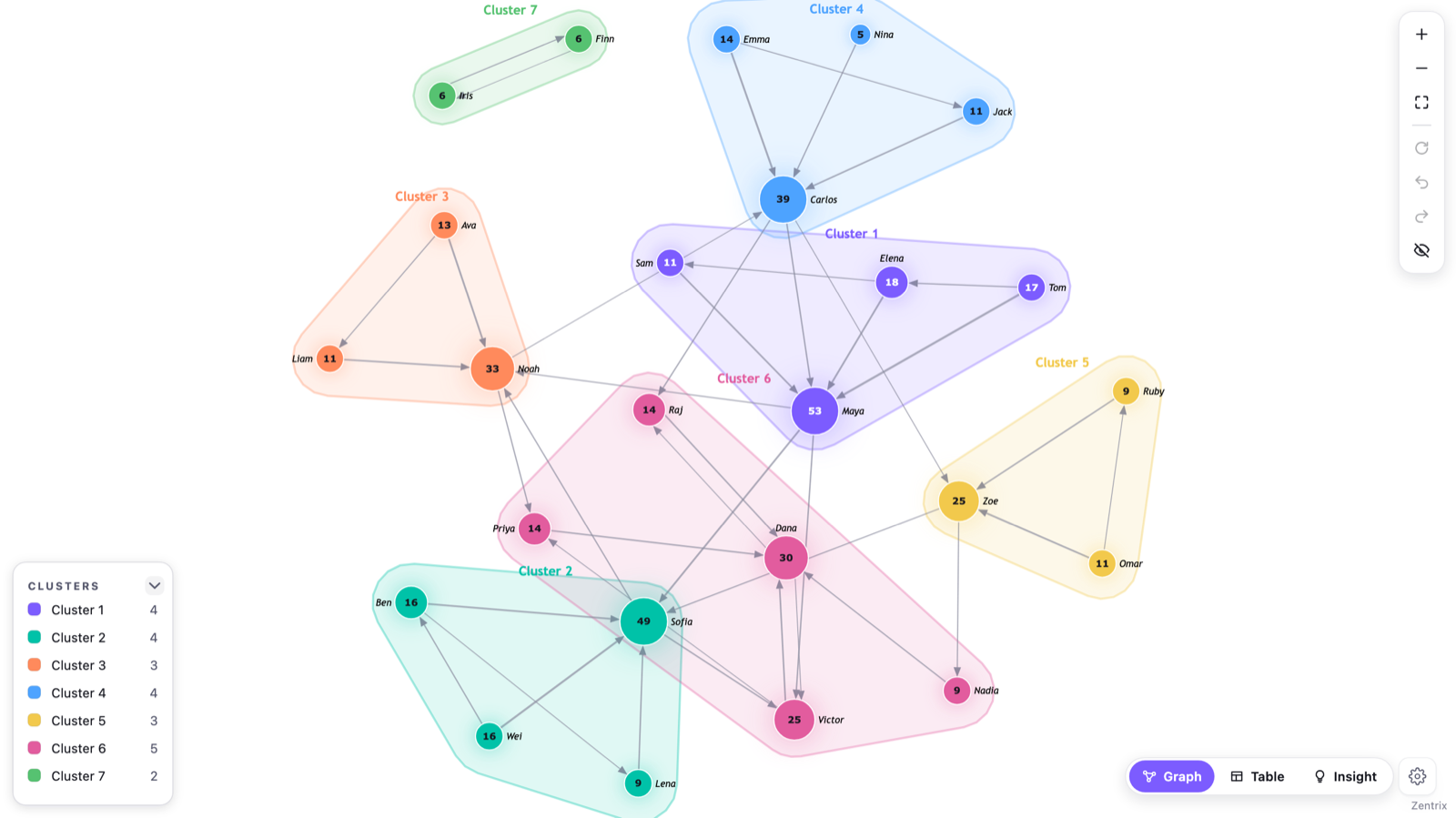
Pro + EnterpriseCommunity detection groups related nodes without you binding a category field, and colours the graph by what it found — that part is Pro. Enterprise draws the hulls around each community, with meta-node collapse, cluster labels and spatial grouping, so the shape of the network reads at a glance.
Built-in insight engine
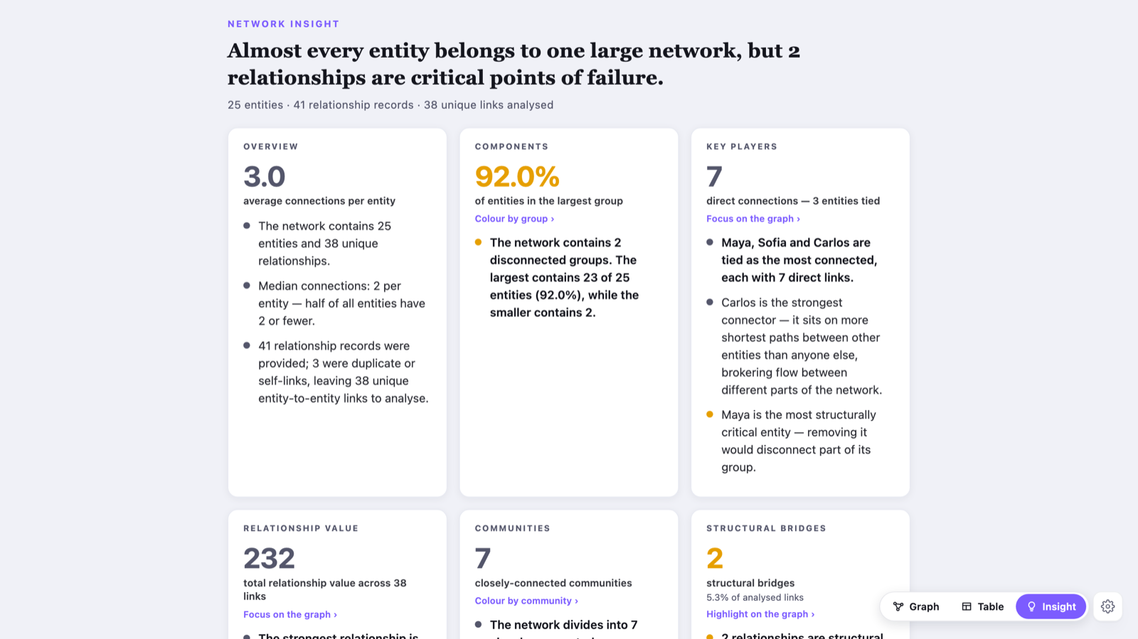
ProA plain-English read-out that names the hubs, the bridges between groups, the isolated pieces and how fragmented the whole thing is — the influential nodes and single points of failure you'd otherwise miss. Findings are clickable: highlight the bridges it named, or colour the graph by the communities it found.
Five layouts, one dataset
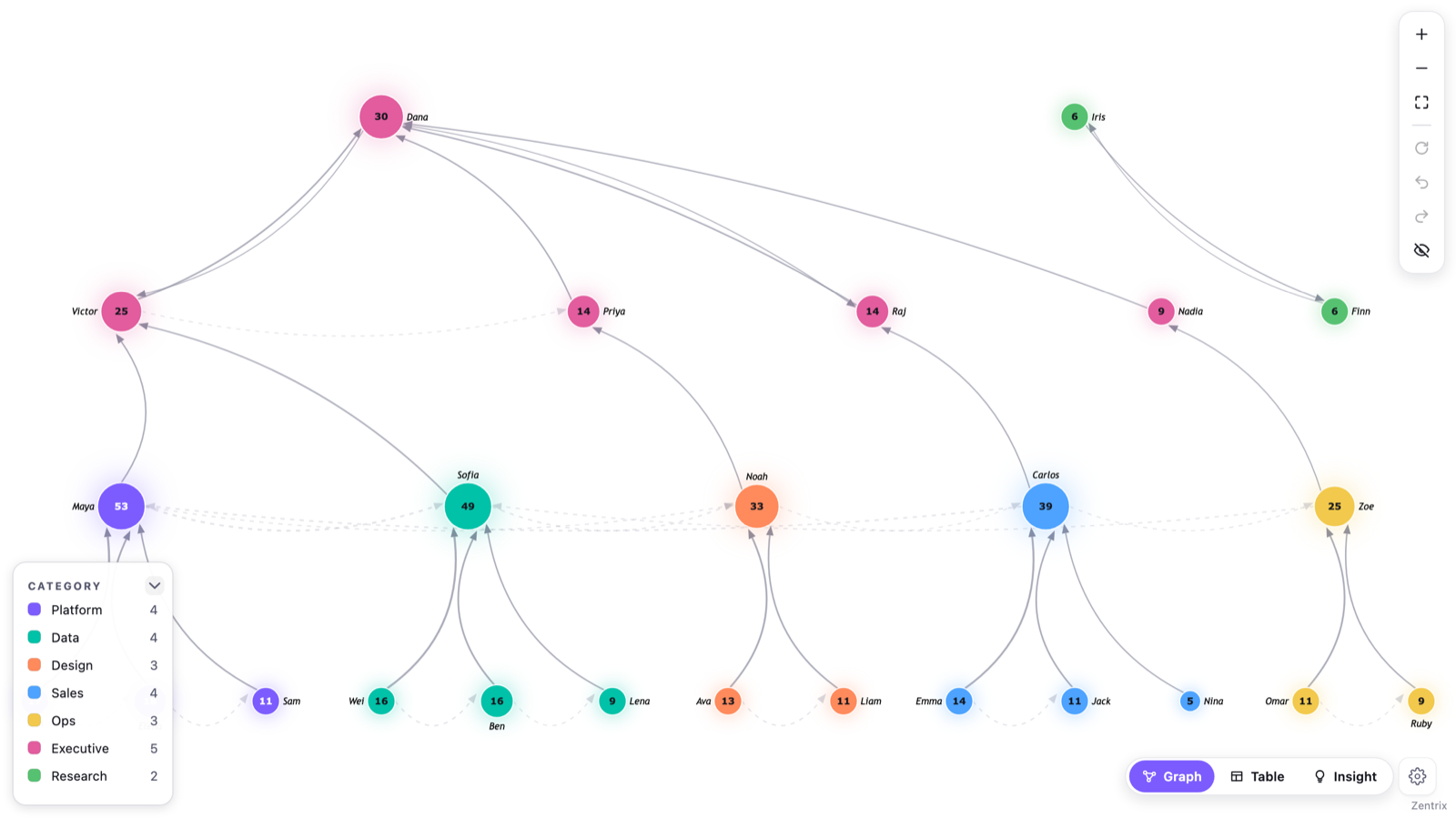
Force-directed, concentric, circular, grid and tree / org-chart, all free and all switched from the in-visual settings bar rather than the format pane. Tree follows your Node parent field when you bind one and derives its own hierarchy when you don't. Geo layout, from latitude and longitude with an offline outline map, is Enterprise.
Three views of the same graph
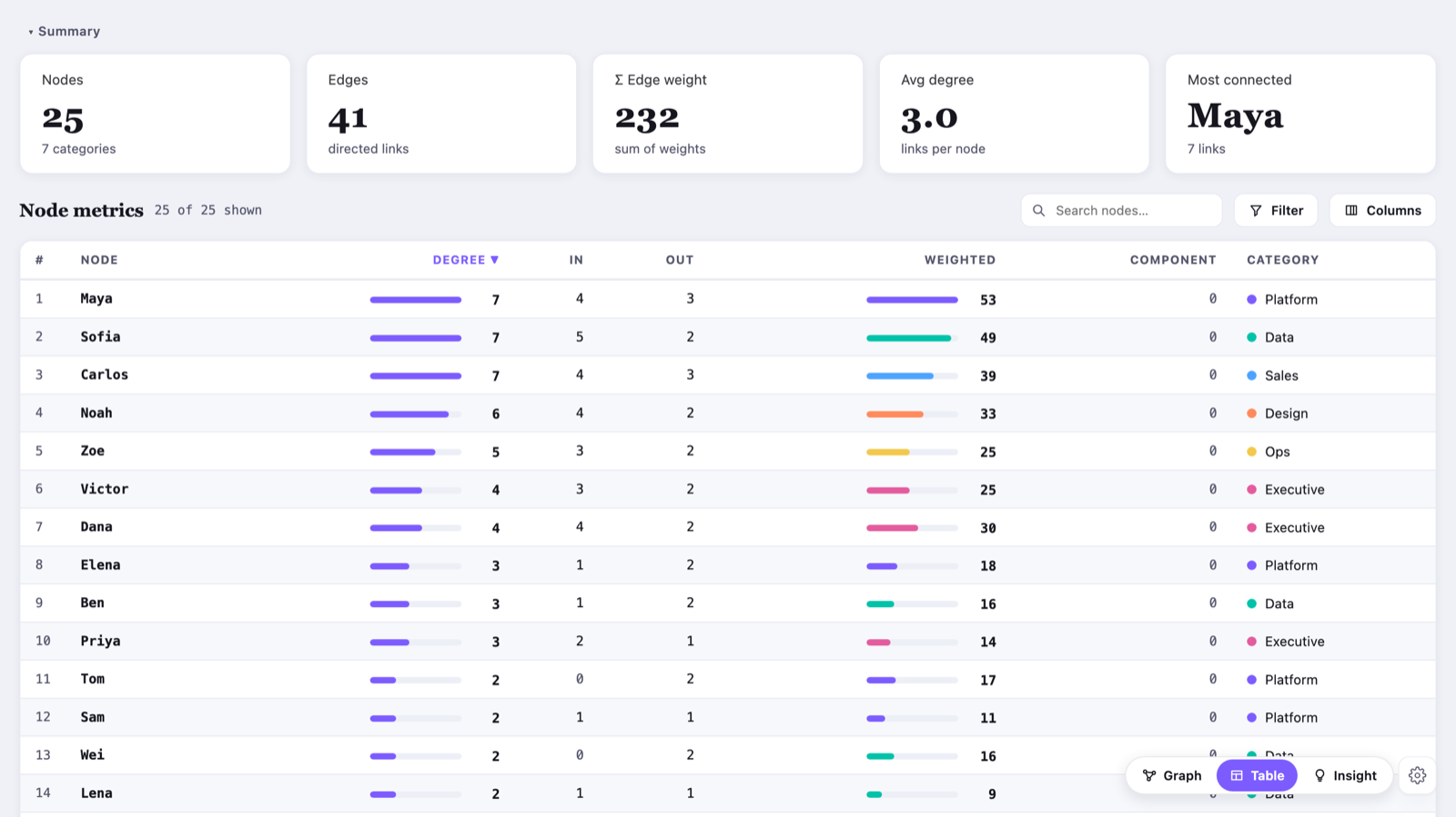
The graph itself and a sortable node-metrics table with degree, in/out and weighted totals — both free, both searchable and filterable, with CSV export. The plain-English insight read-out is the third view, on Pro. Same numbers in all three, so the table and the story never disagree.
Settings inside the visual
28 setting groups and 169 properties live in a floating gear on the canvas, not buried in the format pane, with search that speaks Power BI's own vocabulary — type “data colors” or “conditional formatting” and it finds our control. Quick actions cover zoom, fit, reset, undo/redo, and export to CSV, Excel, PNG or PDF. All free.
Built for real reports
Cross-filters the rest of your report on click, multi-select, keyboard navigation with a visible focus ring, a colourblind-safe palette filter and high-contrast support — every bit of it free. Beyond the node cap it tells you it is showing N of M rather than freezing or dropping data quietly.
Screenshots
The real thing,
not a mock-up
Every image below is a capture of the shipping Network Graph. Where a shot needs a paid plan, its caption says so.
Learn it, then try it
Know every setting
before you open Power BI
The Insight Engine
ProInsights that never
leave your tenant
The Network Graph computes its insights with transparent, deterministic logic — entirely inside the Power BI sandbox. No external calls, no telemetry, nothing leaves your tenant. The read-out itself is a Pro capability; the privacy promise below holds at every tier, free included.
- Hubs — the most connected, influential nodes
- Bridges — nodes that hold separate clusters together
- Isolated clusters & fragmentation
- Network density and overall structure
Runs in the Power BI sandbox
Every insight is computed inside the Power BI visual sandbox. The visual makes no external network calls and sends no telemetry — nothing about your data leaves your tenant.
Deterministic by design
Node positions are seeded from your data, not a random number, so the same data lays out the same way on every refresh. Degree is free; betweenness, closeness and PageRank arrive with Pro. All four are computed with transparent, repeatable logic — no AI black box.
Insight engine, built in
On Pro, the graph doesn't just draw the network — it reads it, naming the hubs, the bridges between groups, the isolated pieces and how fragmented the whole thing is, in plain sentences on the canvas. Nothing is sent anywhere to produce them.
Free and paid
What's free,
and what isn't
Everything that makes a report look good is free — every shape, every palette, every icon, labels, cross-filter, legends, tooltips, search. What's charged for is analysis, scale, and the things that make a report repeatable. There is no watermark at any tier, and the graph always renders.
Free forever, no licence
500 nodes · 2,000 edges
A fully working, fully interactive network — no watermark, no trial clock, no sign-in.
- Five layouts — force, concentric, circular, grid, tree
- All six node shapes, all 18 palettes, the full 45-icon catalog
- Every edge control, outer labels, category and edge legends
- Table view — sortable node metrics, search, filter, CSV export
- Cross-filter, multi-select, lasso, keyboard nav, high contrast
- Top N / Bottom N filtering, node search, and export to CSV / Excel / PNG / PDF
$2.49/user/month or $24.99/user/year
2,000 nodes · 5,000 edges
The analysis maths and the production polish, on small and medium graphs.
- Centrality — bridges (betweenness), reach (closeness), influence (PageRank)
- The plain-English insight read-out, with clickable findings
- Community and component colour modes
- Rules — unlimited conditional formatting, including on computed graph metrics
- Pin layout — freeze an arrangement into the report permanently
- Drill-down, expand/collapse, the node detail panel, animated edge flow
$5.49/user/month or $54.99/user/year
Uncapped nodes and edges
Scale, heavy analysis, and the features that turn a graph into a deployed tool.
- Clustering — Louvain communities with hulls, meta-nodes and spatial grouping
- Path analysis and explore / ego-focus mode
- Canvas renderer, minimap, and loading past Power BI's 30,000-row window
- Geo layout with an embedded offline outline map
- Time animation — a scrubbable temporal axis
- Node annotations saved with the report
Report readers are always free
The licence only applies to the person building the report. Anyone opening a published report gets the whole visual — every feature, no cap, no sign-in, no licence prompt — whatever tier the author is on. You pay per report author, not per reader.
Start free
Start free, and stay free if that's enough
The free tier of the Network Graph is permanent, not a trial — no watermark, no sign-in, no clock running down. Add it from AppSource, drop it on your canvas, and you're running. Upgrade only if you need the paid capabilities above.
Read the Network Graph field guideThe free tier is staying free. If the Network Graph earned its place on your report, you can support the work:
From the blog
- Power BI org chart when someone has two managersWhy tree visuals and PATH break when a node has two parents, the edge table that fixes the data model, and how to draw it in Power BI.6 min read
- Network Graph layout modes in Power BI, and which to pickAll six layout modes in Zentrix Network Graph (Force, Concentric, Circular, Grid, Tree, Geo), what each is for, and the settings that go with them.5 min read