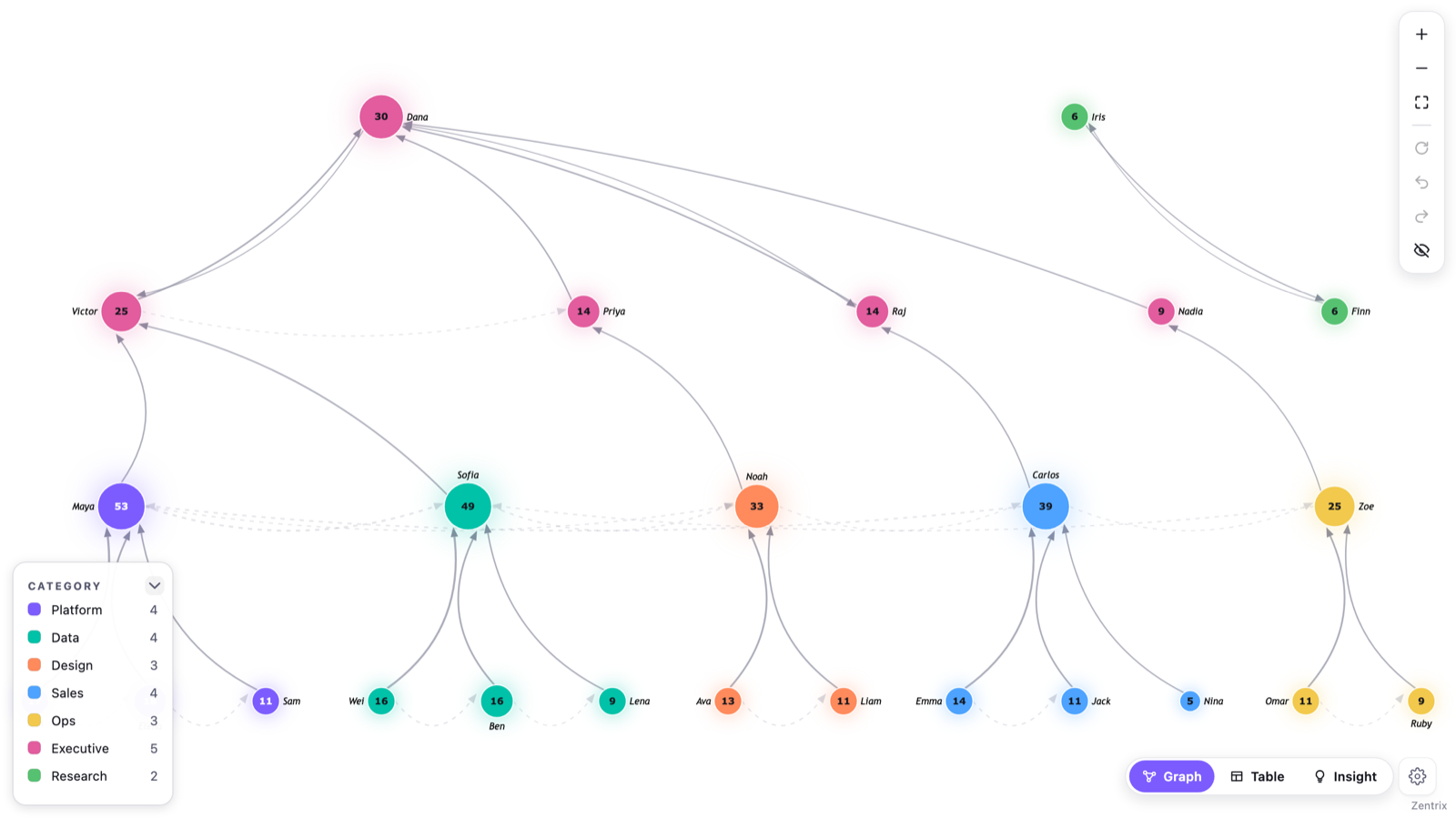
If someone in your data reports to two managers, or a company is owned by two parent companies, it is not a tree any more. Most Power BI hierarchy tooling assumes it is, so it breaks or silently picks one parent. The fix is mostly in the data: stop storing "one parent per row" and store relationships as their own table, one row per link. After that you can draw it as a network, or as a tree with the extra links shown on the side.
This question comes up repeatedly on the Fabric community forum: dual-reporting org charts, companies with several parent companies, shareholders who each own a slice. Below is why the usual approach fails, what the table should look like, and what your options are for showing it.
Why trees and PATH break with two parents
A tree gives every node exactly one parent. That is the definition, not a limitation of any one visual. Dotted-line reporting, joint ventures and split shareholdings are all cases where a node has two or more parents, and that shape is a graph (a set of things and the links between them).
The DAX functions for hierarchies have the same assumption built in. PATH(ID_columnName, parent_columnName) takes one column holding the parent of the current row and returns the chain of parents above it as a text string separated by |. There is no place to put a second parent. Microsoft's documentation also says that if the same ID appears twice with different parent values, PATH() returns an error. So the obvious workaround, adding a second row for the person with their other manager, is exactly the case that fails.
Tree-style visuals are usually fed from that same one-parent-per-row column, so given two rows for one person they have to either show the person twice or choose one of the two parents. Neither gives you the picture you wanted.
What the data model needs to look like
Keep your list of people or companies as it is (a dimension table, one row per entity). Add a second table where each row is one relationship. I call it an edge table:
| from | to | relationship type | weight |
|---|---|---|---|
| Priya | Dana | Line manager | 1 |
| Priya | Raj | Dotted line | 1 |
| Holding A | Target Ltd | Owns | 60 |
| Holding B | Target Ltd | Owns | 40 |
Each row is one link, from one thing to another. A person with two managers is two rows. A company owned by two holdings is two rows, and the weight column carries the ownership percentage. Pick a direction (here, person to manager and owner to owned) and keep it the same within one table. Nothing needs to be unique in the from or to columns, which is the whole point.
Building it from a wide table
Most HR extracts arrive wide: one row per person with columns like Line manager and Dotted-line manager. Power Query can turn that into the edge table with Unpivot. Per Microsoft's docs, unpivot turns the selected columns into two columns: an Attribute column holding the old column headings and a Value column holding the values underneath them.
- Duplicate the
Line managercolumn and name the copyPrimary manager. You will use it later. - Select the original
Line managerandDotted-line managercolumns and choose Unpivot only selected columns. - Rename Attribute to
relationship typeand Value toto. Rename the person column tofrom. - Filter out rows where
tois blank, so people without a dotted-line manager don't produce an empty link. - Add a numeric
weightcolumn. Use 1 if you just want links, or the ownership percentage if you have one.
For ownership data you usually already have this shape (owner, owned, percentage), so you can load it as is.
Ways to show it in Power BI
Which one fits depends on what the reader needs to do.
- A table or matrix grouped by manager. It handles the two-parent case in the sense that the person is listed under each manager. Good for lookup and for exports, but it is a list, not a picture, and you have to be careful about counting the same person twice in totals.
- Flatten one parent and drop the rest. Pick a primary manager, use
PATHandPATHITEMto make level columns, and feed a tree visual. It draws cleanly and it lies by omission. Fine for a formal reporting line, wrong when the dotted line is the thing people are asking about. - A node-link (network) visual fed by the edge table. Every relationship is drawn, whatever the count of parents. Layout gets harder to read as the data grows, which is a layout problem rather than a data problem.
Where Zentrix Network Graph fits
I built Zentrix Network Graph for the third option. Bind from to Source node, to to Target node, and weight to Edge weight, which sets link thickness. Put relationship type in Edge type and links get a colour and line style per type, with a legend. To print the ownership number on each link, turn on Link labels and pick Weight.
It has a Tree layout that is meant for org charts, and I should be specific about what it does with two parents, because it does not turn the graph into a true multi-parent diagram.
- The tree layout places each node under exactly one parent. Every other relationship stays on the chart, drawn as a lighter dashed link that curves across the tree. In the screenshot below, the faint dashed lines are those. The second manager is visible, but the person sits under one of them.
- If you leave the Node parent field empty, the visual works out a hierarchy from link connectivity. It starts from the most connected node in each connected group and walks outward, ignoring link direction. Which of two managers becomes the solid one is decided by that walk, not by anything in your data.
- If you want control over it, bind a Node parent field, using the
Primary managercolumn. The visual reads the parent for a node from the first row where that node appears as Source. So the Node parent value should be the same on every row for that person, which is why the duplicated column from the steps above gets repeated on both of the person's rows. The dotted-line row then draws as the lighter cross-link.
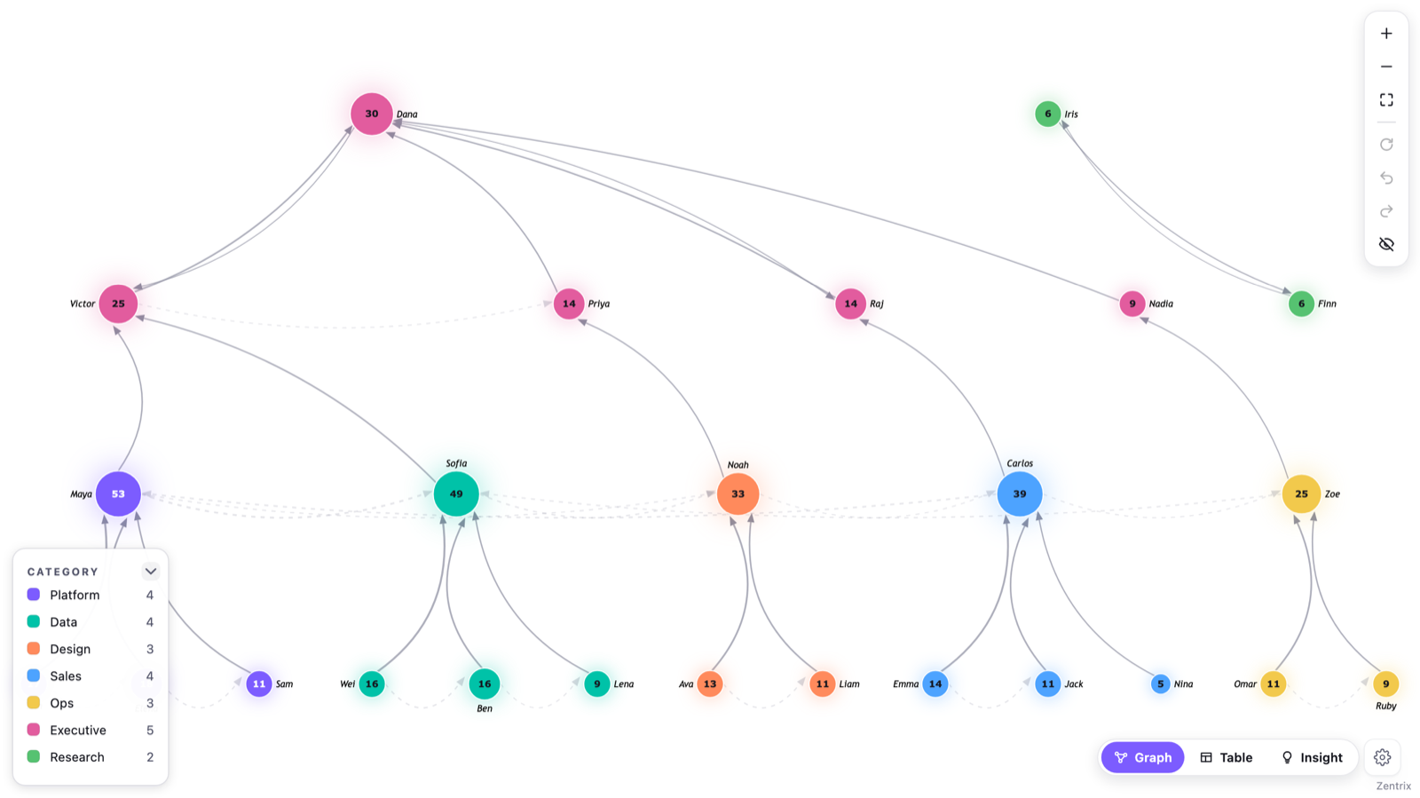
If you want to see the second parent as a first-class link and not a dashed one, switch Layout to Force (or Concentric) instead. Those layouts don't try to force a hierarchy at all.
Two other things are useful for this kind of data. Clusters (Auto uses community detection, or you can cluster by a Node category field) draw a hull around groups that are more connected to each other than to the rest, which helps in big ownership structures. Path analysis lets you pick two nodes and highlights the shortest route between them, and if you turn on Use link values it uses your Edge weight as the cost of each link. It is a shortest-path search, so it will not list every route.
Clusters and path analysis are part of the paid plan when the report is used in the Power BI Service (the online app where reports get shared). In Power BI Desktop, all features are unlocked.
Checklist
- One row per relationship, not one row per person.
- Relationship type as a column, so dotted line and solid line are not mixed up.
- Weight for anything with a number attached (ownership percent, allocation percent).
- If you use a tree layout, decide which parent is the primary one and put it in its own column.