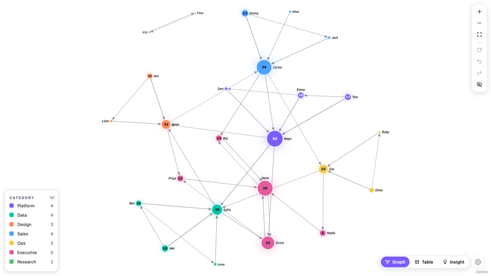
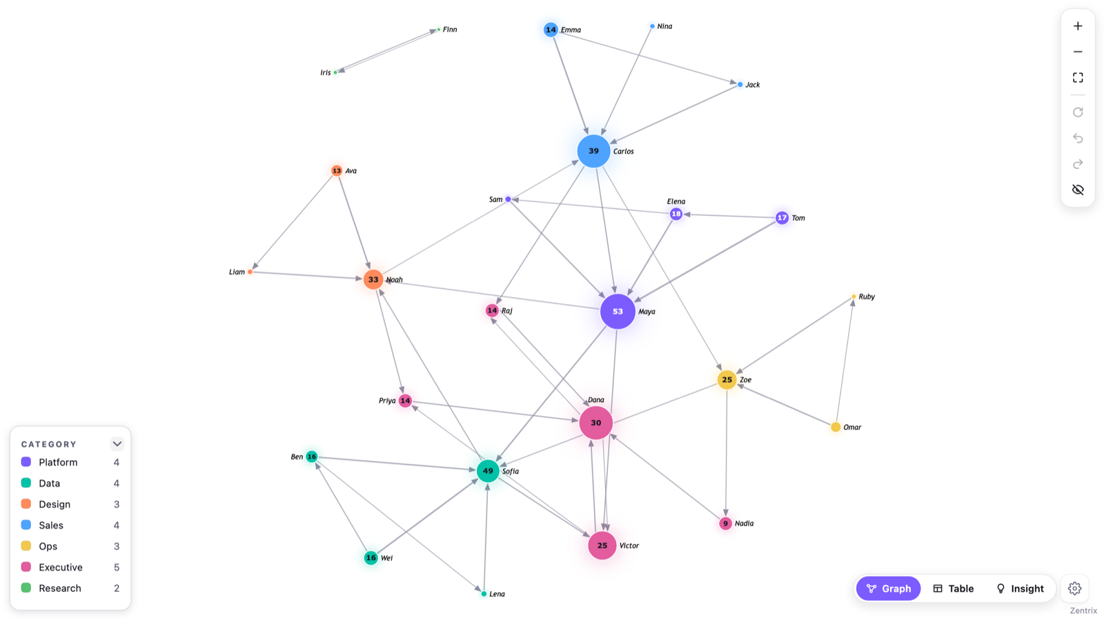
Zentrix Network Graph has six layout modes: Force, Concentric, Circular, Grid, Tree and Geo. Short version of when to use each: Force to find groups you didn't know about, Concentric to see who sits at the core, Circular to count links between nodes, Grid when you need the same node in the same place every time, Tree for org charts and other hierarchies, and Geo when your nodes have latitude and longitude.
Most complaints about network diagrams turn out to be layout complaints, so it is worth knowing what each mode is actually doing. This is the written version of the Layout card walkthrough I recorded (the video is here).
Where the setting lives
Click the gear icon in the bottom corner of the visual. Layout is the first category on the bar. It holds five controls: Mode, Repulsion, Edge length, Outline map and Pin layout. Layout is not in the normal Format pane; the pane only carries toolbar, accessibility and branding, and everything else is in the gear.
Which mode for which question
| Mode | Use it when | Needs |
|---|---|---|
| Force | You're looking for groups and don't know where they are | Source and Target only |
| Concentric | You want to see the core and the periphery | Source and Target only |
| Circular | You need to trace individual links between nodes | Source and Target only |
| Grid | You need a stable, comparable arrangement | Source and Target only |
| Tree | The data is a hierarchy | Node parent field is optional |
| Geo | The nodes are places | Latitude and Longitude |
The six modes
Force
This is the default. Nodes push each other apart and links pull connected nodes together, and the network settles into its own shape. Densely connected groups end up close together, which is why it is the one to use when you are hunting for clusters. If you also switch on Show clusters, a Group by cluster option (in the gear bar, Enterprise category, under Clusters) pulls members of the same cluster closer so the outlines overlap less. That option only works in Force.
Concentric
The most connected node goes in the middle. Everything else is placed on outer rings, with the stronger connections on the inner rings and lower-connectivity nodes further out. Where the graph has real layers, the rings follow how many hops each node is from the centre. Nodes that share a category stay together in a sector of the ring. If you haven't bound a Node category, it groups by connected component instead (or by cluster if clusters are on). You get a hierarchy built from the connections themselves, without preparing a parent field.
Circular
Every node sits on one ring, in an order chosen to reduce crossings and keep connected nodes and groups close together. It is the mode where you can still count the links between two nodes because nothing is stacked on top of anything else.
Grid
Nodes go on a square grid, most connected first, then alphabetical by label. Same data, same cell. It is not pretty, but it is the one to use for screenshots you want to compare side by side.
Tree
The layered org-chart layout. If you bind a Node parent field, it uses it. If you don't, it works the hierarchy out from your links: it takes the most connected node in each connected group as the root and walks outward, ignoring link direction. The Layout card shows a note when the hierarchy is inferred rather than bound, and I would bind the field whenever the report needs the exact business hierarchy.
Each node sits under one parent. If a node has more than one relationship, the extra ones are drawn as fainter dashed links across the tree. I wrote a separate post on org charts where someone has two managers that goes through that.
Tree also defaults to maximum link curvature so parent and child links fan apart. It is only a default: set Curvature under Edges yourself, including 0 for straight links, and your value wins.
Geo
Bind Latitude and Longitude and the nodes are placed where they actually are, with links drawn between them. The Geo tile stays disabled until the visual sees valid coordinates. The world outline behind the nodes is embedded coordinates drawn by the visual itself, not map tiles, and the visual makes no external calls, so nothing about your data leaves the report. The Outline map switch appears only in Geo and turns that background on or off.
One thing to watch: coordinates are read from the first row where a node appears as Source. A node that only ever appears as a Target has no coordinates and is drawn at the centre of the ones that do. If some of your places look bunched in the middle, that is why. Geo also always shows the whole world at a fixed scale, rather than zooming to fit your data, and Avoid overlap is unavailable because positions are exact.
The settings that go with them
Repulsion and Edge length
These two sliders only do something in Force. Repulsion (1 to 200, default 30) is how hard nodes push each other apart. Edge length (5 to 200, default 30) is how long the links prefer to be. Between them they are the difference between a hairball and something readable: raise Repulsion when nodes sit on top of each other, raise Edge length when labels collide.
In every other mode the two sliders grey out and say why, instead of letting you drag a control that isn't connected to anything. The exception is Geo without coordinates, which falls back to Force, so the sliders stay live there.
Deterministic layout
Force is not random. Each node's starting position comes from a hash of its own name, and the simulation runs a fixed number of steps (300 for graphs up to 800 nodes, fewer above that), so the same data draws the same picture on every refresh. You don't have to pin anything to get that.
Pin layout
Pin layout is the separate thing. It saves the current node positions into the report, so a refresh or reopening the report reuses them instead of calculating again. If nodes are added after you pinned, the existing ones stay where they are and the new ones appear at their own starting positions.
Two behaviours worth knowing. Dragging a node by hand pins the layout for you, which is how you keep an arrangement you made yourself. And choosing a different mode clears the pin, so the new mode actually runs. Turn Pin layout off to recalculate.
Avoid overlap and Node gap
These live under Nodes, not Layout, but they apply on top of any mode. Avoid overlap nudges overlapping nodes apart after the layout runs, and Node gap sets how much clearance you want between them. Both are unavailable in Geo with real coordinates.
A note on the plans
Geo and Pin layout, along with clusters, are part of the paid plan when a report is used in the Power BI Service (the online app where reports get shared). In Power BI Desktop, everything is unlocked. Force, Concentric, Circular, Grid and Tree are not gated.