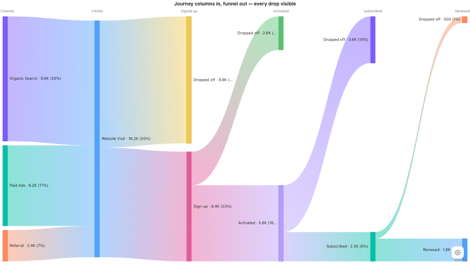
A funnel chart tells you how many people you lost at each stage. It can't tell you which people. If Organic, Paid and Referral all go into one bar, the bar is an average of three different funnels, and a channel that leaks at one specific step looks like a normal drop.
A Sankey keeps the paths apart, so the channel stays visible from the first stage to the last. This post covers how to shape the data for it, how to read the result, and what to do when the data has loops, skipped steps or too many nodes. The examples use made-up demo data: three channels (Organic Search, Paid Ads, Referral) through six stages, from first visit to renewal.
Shape the data first
There are two ways to feed a Sankey. Which one you use depends on how your table looks today. I'm using the field names from Zentrix Sankey Pro here, since that's the visual I built and can check. Other Sankey visuals name their fields differently.
Source, destination, value
One row per link. Each row says how much flows from one node to another.
| Source | Destination | Value |
|---|---|---|
| Website | Product Page | 10,000 |
| Product Page | Cart | 4,500 |
| Cart | Purchase | 1,700 |
Put the columns in the Source, Destination and Value wells. Value is optional. If you leave it empty, each row counts as 1. Repeated source and destination pairs are added together, so you don't need to pre-aggregate.
Journey columns
Most funnel data doesn't look like the table above. It's usually one row per path with one column per stage. Zentrix Sankey Pro calls this the Automatic Journey Builder: drop two or more stage columns into the Stages well, in order, and it turns consecutive stages into links for you. No calculated source/destination table in Power Query.
| Channel | Visited | Signup | Activated | Value |
|---|---|---|---|---|
| Referral | Website Visit | Sign-up | Activated | (count) |
| Referral | Website Visit | Sign-up | (count) | |
| Referral | Website Visit | (count) |
Some details that matter:
- A blank at the end means the person stopped there. That's what drives the drop-off view below.
- A blank in the middle means the stage was skipped. The row connects the nearest non-blank cells on either side, so a lead who goes straight to Won still lands in the right place.
- The same label in two different stages is two different nodes. "Active" in stage 2 and "Active" in stage 4 don't get merged.
- Stage titles come from your column names. Turn on
Show stage titlesin the Stages settings, since it's off by default. - Put the channel in
Link categoryas well. When every channel merges into one Website Visit node, the ribbon keeps its channel colour because the category is part of the link. Set link colour toBy link category.
Switch the view to Drop-off
Set View to Drop-off (funnel). For every stage where more people arrive than move on, the visual adds a Dropped off branch carrying the difference, with the count on it. The label text is editable (Drop-off label). Stages where everyone moves on get no branch, and the final stage doesn't get one either, since ending there is the point of the funnel. If nothing was lost anywhere, the diagnostics strip says so instead of silently showing an unchanged chart.
Six things to look at
This is the order I read it in.
- Each column is a stage. The titles are your column names.
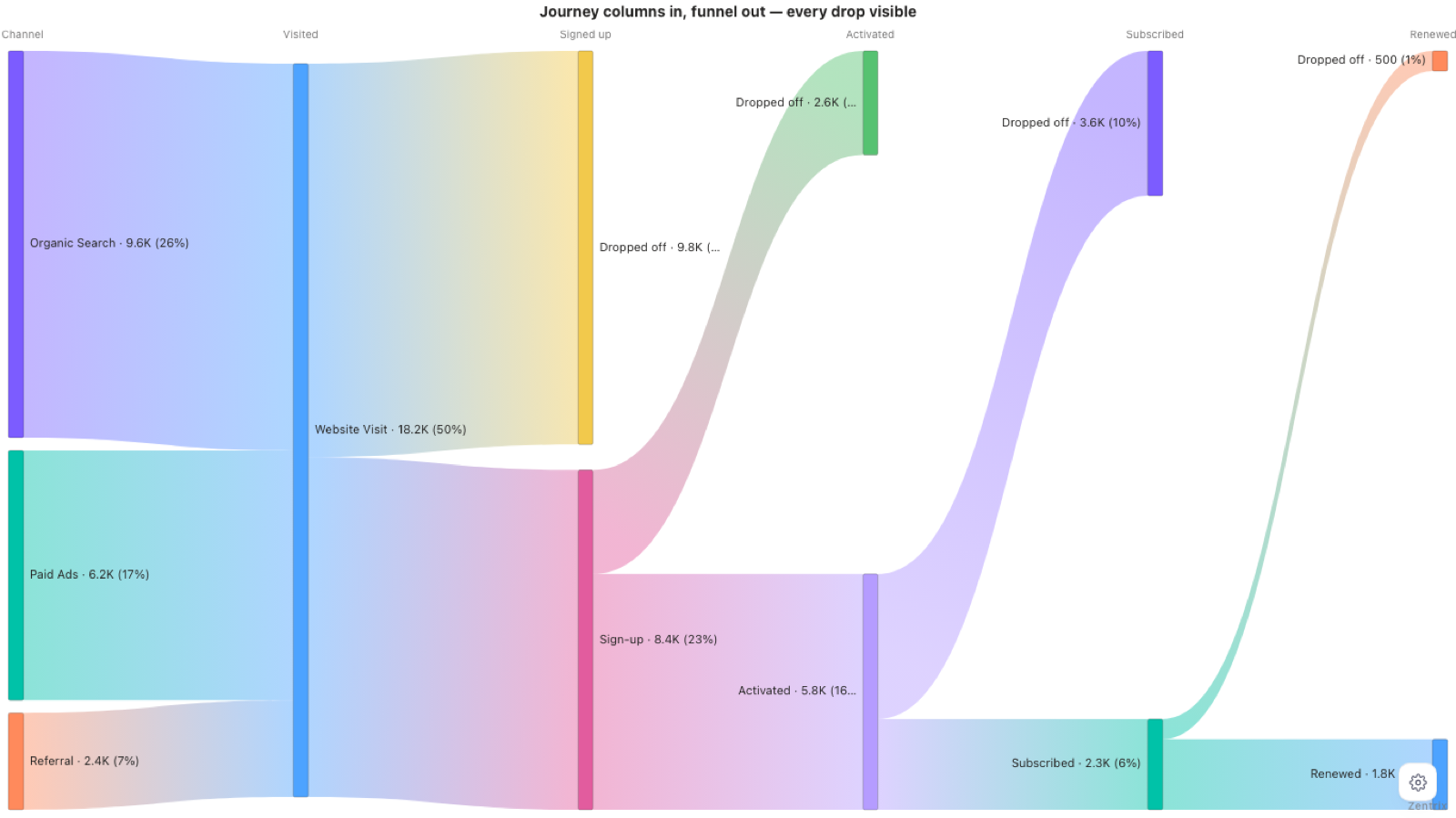
- Colour is the channel, if you ask for it. The screenshot above uses the gradient colouring, so colour follows each node. Put the channel in
Link categoryand set link colour toBy link category, and the channel colour stays attached from the first column to the last, even after the channels merge into one node. - Width is people. In the demo, 4.2K of the organic visitors signed up (900 + 260 + 1,750 + 1,290 across the organic rows), and that is exactly the width of their band into Sign-up.
- The
Dropped offbranches are the people who stopped. The biggest one in the demo is the 9.8K visitors who never signed up (18,200 visits minus 8,430 sign-ups). - Check each channel's rate at the same stage. Referral signs up best: 57.5% of its visitors, against 43.8% for Organic and 46.0% for Paid.
- Then check the next stage. Activation is about the same for all three (69.3% to 69.6%), so the difference isn't there. It's at Activated to Subscribed.
| Channel | Visited to sign-up | Sign-up to activated | Activated to subscribed |
|---|---|---|---|
| Referral | 57.5% | 69.6% | 32.3% |
| Organic | 43.8% | 69.3% | 39.9% |
| Paid | 46.0% | 69.5% | 39.4% |
Referral has the best top of funnel and then loses more of its activated users at the subscribe step than the other two. A funnel chart draws one bar per stage, so those three rates get blended and the subscribe step looks like an ordinary drop. In the Sankey, coloured by channel, it shows up as Referral's ribbon between Activated and Subscribed being thinner than its earlier bands would suggest. The numbers are invented, but it's the kind of thing I'd want a report to catch.
One thing to be careful about: the first thing you notice in a Sankey is usually the biggest Dropped off branch. The biggest drop isn't automatically the one worth acting on. Compare the same step across channels first.
Cycles, skipped stages and self-links
Real data isn't a clean left-to-right line. Here is what the visual does with the awkward cases.
- Cycles (source and destination mode). A to B and B back to A, or a ticket that gets reopened. The layout works out each node's column by following the forward links and ignoring the link that closes the loop. The returning link is still drawn, and it runs backwards. Nothing errors and the same data always gives the same layout.
- Self-links. A row where source equals destination isn't drawn as a ribbon. It's counted and reported on the diagnostics strip ("N self-links present"), so you know they were in the data.
- Skipped stages (journey mode). Covered above. A blank in the middle of a row connects across it.
- Repeated values in journey mode. If a row has the same value in two consecutive stages, it's a link between two separate nodes, one per stage. You get a warning ("self-transition detected") so it doesn't pass unnoticed.
Top-N and Other, and why honest truncation matters
A Sankey with 60 nodes per stage is unreadable, so you need to cut nodes. The risk is cutting them quietly. If the chart shows the top 10 pages and drops the rest without saying so, every percentage on screen is now measured against a smaller total than your real one.
In Zentrix Sankey Pro this lives under Filter, then Nodes:
Show:All,Top NorBottom N, withHow many (N)andRank by(node value, inflow or outflow).Count N:Across the diagramorWithin each stage. Across the diagram can empty a whole column if all its nodes are small. Within each stage keeps a full-width funnel.Group removed as "Other"(on by default, and only available under Top N): the nodes you cut are rolled into one bucket per stage instead of vanishing. Every stage still adds up to the full value, and the bucket's name is editable (Other label).Keep connecting nodes: re-adds the nodes that hold the surviving paths together, since removing a middle node cuts every path through it.
With Other turned off, the removed nodes and their flows are hidden, and "% of total" changes because the total changed. The setting Percentages are a share of lets you choose between the shown data and all data, and the diagnostics strip states which one you're looking at. It also reports what was cut: how many nodes were filtered out, how many were grouped into Other, and "showing N of M flows" when a flow cap applies. You can also hide flows below a value or a percent share of the total, or cap the number of flows drawn with Max flows.
My view is that a chart that hides data should say so on the chart, not in a settings pane nobody opens. If you use any Sankey visual with a node limit, check whether it tells you what it dropped.
Trying it on your own data
Zentrix Sankey Pro is free and fully unlocked in Power BI Desktop, with no watermark and no time limit. A licence applies once the report is published to the Power BI Service (the online app where reports get shared). The listing has a sample .pbix if you want to see the journey setup before wiring up your own table.