Zentrix Financial Chart
Candlesticks that don't invent trading days you never had.
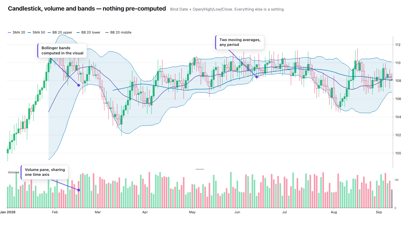
An advanced financial and time-series visual for Power BI, built on one engine that draws candlesticks, OHLC bars, lines and areas. An ordinal “trading days” axis closes the weekend and holiday gaps that stretch every other Power BI candlestick, a price axis handles linear, log, fixed bounds, display units and indexed or percentage modes, and a volume pane sits under the price with SMA, EMA, WMA, Bollinger bands, VWAP, RSI and MACD. It validates your OHLC rows before it draws them and says which ones it rejected — all computed inside the Power BI sandbox.
- Chart types
- Candlestick, OHLC, line, area
- Indicators
- SMA · EMA · WMA · Bollinger · VWAP · RSI · MACD
- Axes
- Ordinal trading-days or continuous time; linear or log price
- Scale
- 25,000 rows, decimated to stay truthful at any tile width
- Accessibility
- Keyboard nav, focus ring, screen-reader announcements
- Privacy
- No external calls, no telemetry
- Price
- Free in Power BI Desktop; from $1.99/user/month in the Service
See it in action
A quick look at the
Financial Chart
Zentrix Financial Chart — the maths is in the visual, not in your DAX
Features
Built to surface
what matters
Four chart types, one engine
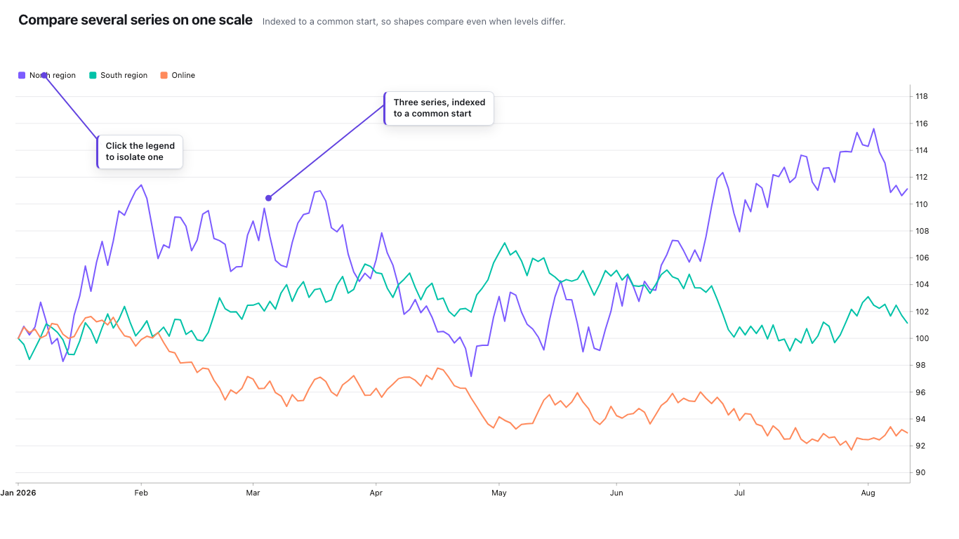
Candlestick, OHLC bar, line and area render from the same pipeline, so switching type never changes the axis, the tooltip or the selection behaviour. Multi-series with a legend you can isolate from, plus conditional formatting with a working rules editor and per-value colour swatches.
An axis that skips the weekend
An ordinal “trading days” axis places bars by row rather than by date, so Friday sits beside Monday and a two-day gap stops stretching every week. A continuous time axis is there when you want real elapsed time. Ticks adapt to the width and rotate their own labels rather than overlapping.
Indicators and a volume pane
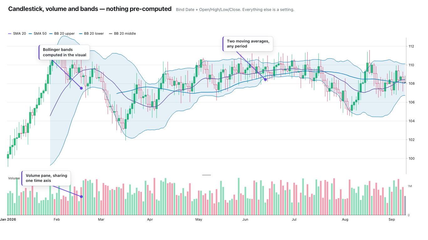
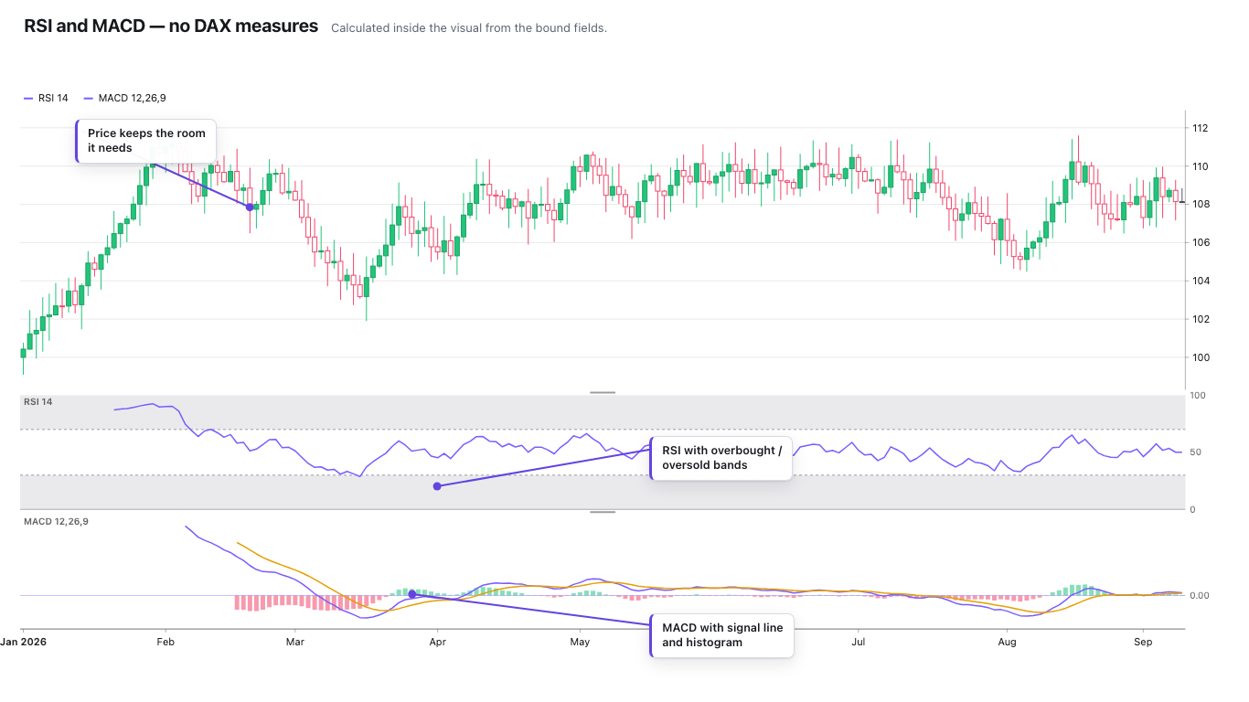
A volume pane under the price, and SMA, EMA and WMA moving averages, Bollinger bands, VWAP, RSI and MACD — RSI and MACD in their own panes. All computed in the sandbox from the data you bound, with no external service.
A price axis that behaves
Linear or log (guarded against non-positive values), fixed bounds when you need a comparable scale, display units, and percentage or indexed modes for comparing instruments that start from different prices. Constant and data-driven reference lines live in Power BI's own Analytics pane.
It checks your OHLC before drawing it
Rows where the high and low don't bracket the open and close are a silent source of wrong candles. This validates them, draws an actionable data-quality banner and raises Power BI's own warning icon, naming what it rejected instead of quietly plotting nonsense.
Built for real reports
Cross-filter, cross-highlight, bookmark and spotlight restore, and the host context menu. Keyboard navigation with a visible focus ring and screen-reader announcements, an rAF-throttled crosshair, branded or native tooltips, and a focus-mode fallback when the tile gets too small for the full chrome.
Screenshots
The real thing,
not a mock-up
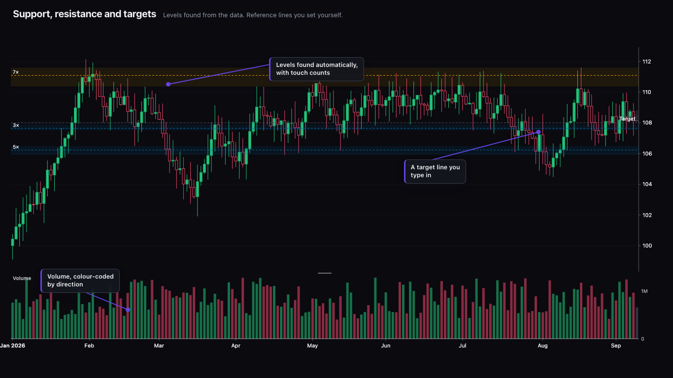
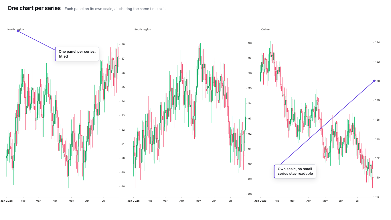
Every image below is a capture of the shipping Financial Chart. Where a shot needs a paid plan, its caption says so.
The Insight Engine
Insights that never
leave your tenant
The Financial Chart computes its insights with transparent, deterministic logic — entirely inside the Power BI sandbox. No external calls, no telemetry, nothing leaves your tenant.
- Moving averages — SMA, EMA and WMA
- Bollinger bands and VWAP
- RSI and MACD, each in its own pane
- OHLC validation — which rows were rejected, and why
Runs in the Power BI sandbox
Every insight is computed inside the Power BI visual sandbox. The visual makes no external network calls and sends no telemetry — nothing about your data leaves your tenant.
Indicators, not opinions
It computes the standard maths — moving averages, Bollinger, VWAP, RSI, MACD — and validates your OHLC rows before drawing them. It does not write you a narrative, and it does not guess: there is no AI anywhere in it, and the same data always produces the same candles.
Honest about your data
Rows whose high and low don't bracket the open and close are named in a data-quality banner rather than silently plotted, and 25,000 rows are decimated by a bucketing pass that keeps the extremes rather than dropping them.
Free and paid
What's free,
and what isn't
Power BI Desktop is free and fully unlocked — every feature, every indicator, no row limit, no watermark and no sign-in, forever. You can build and publish an entire production report without paying. A licence starts when that report is opened in the Power BI Service, and there everyone who opens it needs a seat, author and reader alike. All four plans unlock the identical product; they differ only in the seat band you are billed at.
Free forever — in Power BI Desktop
Everything unlocked · 25,000 rows
The complete visual in Power BI Desktop, with nothing held back and nothing capped. Not a trial. A plan is what carries it into the Power BI Service.
- All four chart types — candlestick, OHLC, line and area
- Every indicator — SMA, EMA, WMA, Bollinger bands, VWAP, RSI and MACD
- The volume pane and the ordinal trading-days axis
- OHLC validation with the data-quality banner
- No watermark, no sign-in, no row limit
$4.99/user/month or $49.90/user/year
Everything unlocked · 25,000 rows
The whole visual in the Power BI Service for one team — a finance desk, an analytics group, a single product line.
- The identical product — no feature is held back for a higher plan
- Seats for everyone who opens the report, author and reader
- One month free, run by Microsoft
- Billed by Microsoft, no separate account
$3.69/user/month or $36.90/user/year
Everything unlocked · 25,000 rows
The same product at a lower per-seat rate once you pass 25 people. Not a bigger tier — a bigger band.
- Everything in Team, feature for feature
- About 26% off the Team per-seat rate
$2.79/user/month or $27.90/user/year
Everything unlocked · 25,000 rows
The same product again, at the rate for a few hundred seats.
- Everything in Team, feature for feature
- About 44% off the Team per-seat rate
$1.99/user/month or $19.90/user/year
Everything unlocked · 25,000 rows
The lowest per-seat rate, for 251 seats and up. If you would rather not count seats at all, or you need Report Server, embedded or publish-to-web, we sell a company-wide licence directly.
- Everything in Team, feature for feature
- About 60% off the Team per-seat rate
- The annual price is ten months of the monthly one
Everyone who opens the report needs a seat
The Financial Chart is licensed per person in the Power BI Service — readers included, the same model as Sankey Pro and not the creators-only one the Network Graph uses. Seats are assigned to named users in your Microsoft 365 admin centre, so you buy them only for the people who actually open a report containing the visual. Plans are sold and billed by Microsoft, which runs a one-month free trial on all four. Power BI Report Server, embedded applications and publish-to-web are not covered by any AppSource plan, because Microsoft's licensing does not operate there — those are sold directly, at support@zentrixstudio.in.
Start free
Start free, and stay free if that's enough
The free tier of the Financial Chart is permanent, not a trial — no watermark, no sign-in, no clock running down. Add it from AppSource, drop it on your canvas, and you're running. Everything is unlocked in Power BI Desktop; a licence applies once the report is used in the Power BI Service.
Read the getting-started docsThe free tier is staying free. If the Financial Chart earned its place on your report, you can support the work: