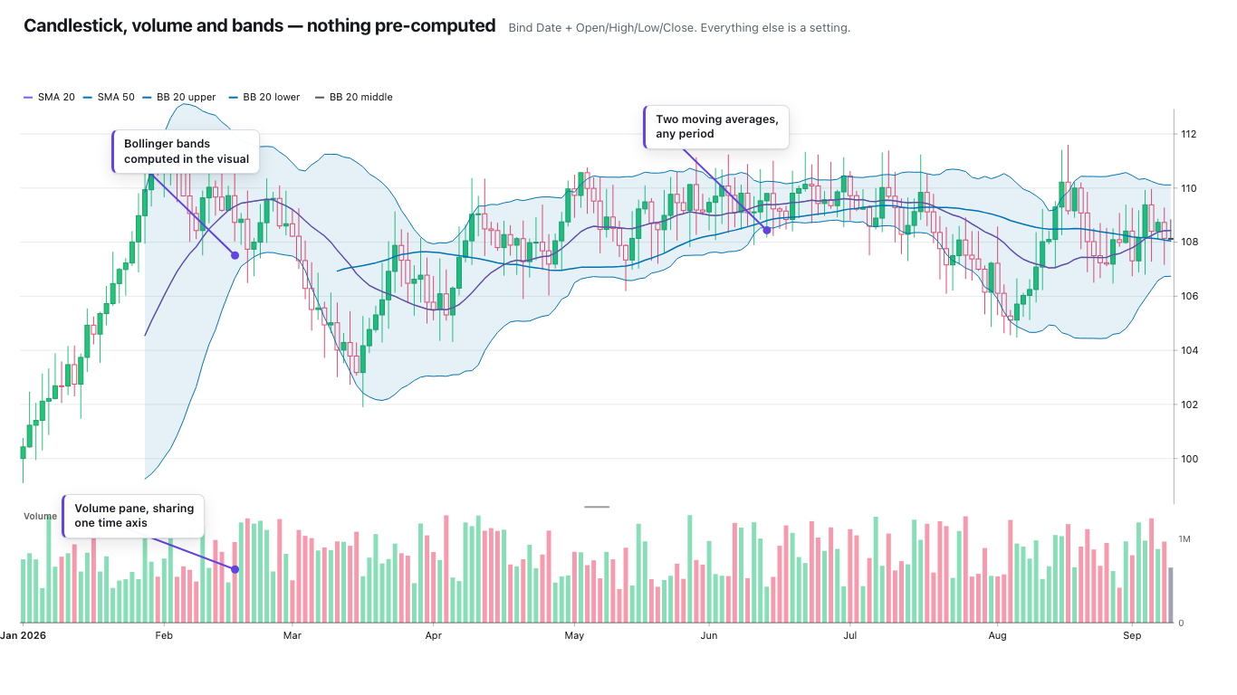
If you plot daily prices in Power BI on a date axis, every weekend and market holiday becomes a gap. On a line chart it's an awkward flat stretch or a break. On a candlestick chart it's worse: the candles squeeze together in groups of five with a hole between each week, and a long holiday weekend looks like something happened. This post explains why it happens, how to fix it with the built-in visuals, and what a candlestick visual needs to do to avoid it.
Why the gaps are there
Power BI charts have two kinds of category axis. A continuous axis is a scale, and it's the default for numbers and dates. A categorical axis, in Microsoft's words, "shows each value as a separate category". Text fields are always categorical.
A continuous date axis places each point by its date. Saturday and Sunday still exist on that scale, there's just no row for them, so the space is left empty. For a lot of data that's correct. If a sensor stopped reporting for two days, you want to see the hole. Trading data is different: markets are closed at the weekend, so the gap isn't information, it's noise.
The built-in fix for line and column charts
For the standard visuals, the fix is to stop placing points by date:
- Make sure the dates you put on the axis only include trading days. Usually that means using the date column from your price table, or a date table filtered to days that have prices, rather than a full calendar table.
- Put the plain date field on the X-axis, not the automatic date hierarchy (right-click the field in the well and pick the field name instead of Date Hierarchy).
- In Format visual, expand the X-axis and change Type from Continuous to Categorical.
Now each date gets an equal slot, and Friday sits next to Monday. The tradeoff, from Microsoft's own docs: a categorical axis shows a scrollbar when the content doesn't fit, so a long history no longer fits in one view. You can set the Initial scroll position to End so the latest dates show first, which helps for price charts.
That fixes the line chart. It doesn't give you candlesticks, because there isn't a candlestick or OHLC chart among Power BI's built-in visuals.
What a candlestick visual needs to get right
A candlestick visual has to solve the same axis problem, plus a few that are specific to OHLC (open, high, low, close) data. When I built the Zentrix Financial Chart, these were the things I treated as requirements.
An axis by row, not by date
The Financial Chart has two axis modes. Trading days gives every bar an equal slot in row order, so weekends, holidays and trading halts close up because a day without a row simply has no slot. That also means the visual never needs to know your exchange's holiday calendar. Continuous time is a real time scale where gaps show as gaps, which is right for data where a missing interval means something.
The tick labels are placed where the calendar changes, a new month on daily data or a new hour on intraday data, rather than at every Nth bar. That keeps labels on real dates in both modes.
One row per date, or the candles are wrong
This is the most common way OHLC charts go wrong in Power BI, and it isn't the visual's fault. Power BI aggregates every value per axis category, and the default for a numeric field is Sum. With exactly one row per date, the sum of one value is that value, so everything looks fine. Put two rows under the same date (intraday rows shown on a daily axis, or the same symbol from two sources) and you get the sum of the highs and the sum of the opens. The candles come out impossible: a high below the open, a body poking out of its own wick.
The fix is to give the chart one row per date and per symbol, by summarising in your model or by putting the finer timestamp on the axis. For High and Low you can also set the field's aggregation to Maximum and Minimum in the field well, which Power BI supports for numeric fields.
The Financial Chart checks every bar before drawing it. If the high doesn't sit above the open and close, or the low doesn't sit below them, it shows a data-quality banner saying how many bars are affected. When nearly every bar is invalid, it says the likely cause is several rows per date being added together, because bad source data is usually scattered while a wrong aggregation breaks almost everything at once. It also reports bars with missing values (drawn as gaps, not guessed), repeated timestamps it combined, rows that arrived out of order, and unusually large gaps in the dates, with a note that the Trading days axis closes them and Continuous time shows them.
Log scale and non-positive prices
Long price histories are often easier to read on a log scale. A log axis can't show zero or negative values, which Microsoft's axis docs also note for the built-in charts. The Financial Chart warns when the data has zero or negative prices and falls back to a linear axis instead of drawing something misleading.
A short checklist
- One row per date (and per symbol) at the grain you're plotting.
- Use your price table's dates on the axis, not a full calendar.
- Built-in visuals: X-axis Type set to Categorical, initial scroll position End.
- Candlesticks: a visual with a trading-days or row-based axis, and check how it handles bars where high and low don't bracket open and close.
- If you use a log scale, check for zero or negative values first.
The Zentrix Financial Chart draws candlestick, OHLC, line and area from the same data, with a volume pane and the usual indicators, and it's fully unlocked in Power BI Desktop. A licence applies once the report is used in the Power BI Service.