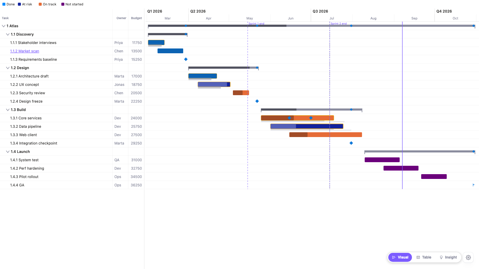
If you are building a project or portfolio Gantt in Power BI, the short version is this. A parent (summary) task should take its dates from the earliest start and latest finish among its children. Its percent complete should be weighted by duration. Its status should be built from the real children below it. A baseline is a saved copy of the original dates, and "late" only means something once you say which baseline you are comparing to. The critical path is the chain of tasks with zero float. The rest is detail and the ways each goes wrong.
I built a Gantt visual for Power BI (Zentrix Advanced Gantt), so the specifics below come from what its code does. The rules are general and work in DAX or any Gantt.
Parent dates: envelope, nothing clever
A summary row has no dates of its own. Its start is the earliest child start and its end is the latest child end, all the way up the tree. If a child moves, the parent moves with it. That includes milestones. A milestone takes zero days, but its date still counts toward the parent's end.
Dates typed onto parent rows by hand drift the first time a child changes. In my visual, parent rows are not read from data at all. They are built from the hierarchy columns (Discovery, Design, Build and so on) and computed from the children that are visible. If row-level security hides a child, the parent recomputes from what is left.
Parent progress: weight by duration, not by count
Averaging the children's percent complete treats a 2-day task and a 60-day task as equal. The correct formula is the sum of (duration x percent) divided by the sum of durations.
Here is a real example from the sample plan. The Design phase has three tasks and one milestone:
| Task | Days | Complete |
|---|---|---|
| Architecture draft | 21 | 100% |
| UX concept | 24 | 90% |
| Security review | 12 | 60% |
| Design freeze (milestone) | 0 | - |
Weighted by duration: (21 x 1.00 + 24 x 0.90 + 12 x 0.60) / (21 + 24 + 12) = 49.8 / 57 = 87%. A plain average of the three percentages gives 83%. If the milestone joins that average at 0%, you get 62.5%. That is a 25-point spread on one phase from one dataset. Only the first number holds up if someone checks it.
A few details from how the visual implements it, since they are decisions you would face in DAX too:
- Milestones are excluded. Zero days means zero weight, so no special case is needed.
- A child with no percent value is left out of the calculation. It is not counted as 0%, which would drag the parent down for a missing value. If no child has a value, the parent shows blank instead of a made-up 0.
- Weights are calendar days from start to end, weekends included.
- When a child is itself a parent, its rolled-up percent is used and its weight is its own span, first start to last end. A sub-phase with a long gap in the middle weighs more than the sum of its tasks' days.
- If your organisation has its own formula, the visual can show a parent-progress field from your model instead. If that field is not bound, the parent shows blank.
Parent status: don't let a green bar hide a late child
The second trap is status. If a parent shows the status of its first child, or a colour someone typed in, a phase can look fine while one task inside it is late. There are two defensible rollups:
- Worst of children: the highest-priority status matched by any descendant. One late task turns the phase late.
- Most common: the status the most descendants match.
In the visual, both use real descendants only, and a parent with no matching descendant stays blank. "Worst" means Rule 1 beats Rule 2 beats Rule 3. It is off by default and needs at least one status rule set up first. For anything a steering group reads, I would start with worst-of-children.
Baselines: planned versus current
A Gantt bar tells you when a task is happening. A baseline tells you when it was supposed to happen. You store the original start and end dates in two extra columns and draw them next to the current bar. The visual draws a grey bar under the task, from the baseline start to the baseline end. When the coloured bar hangs past the end of its grey bar, that overhang is the slip.
Some things worth knowing:
- Variance is the current finish minus the baseline finish, in days. Positive means late.
- You can bind up to 3 baselines, which is useful once a plan has been re-baselined. The Nth start column pairs with the Nth end column, and a baseline is only drawn when both are present.
- A "Primary baseline" setting picks which one drives the variance outline, the tooltip row and the variance column. The others show as extra "vs" rows. On the sample plan, two tasks that are 7 days late against baseline 1 come out 8 and 6 days early against baseline 2. The work did not change, only the plan it was compared to.
- Baselines are drawn on tasks, not on summary rows, and a task without baseline dates gets no grey bar.
- There is no separate "actual start / finish" field. The start and end you bind are the current schedule.
Critical path in a few lines
The critical path is the chain of tasks that sets your end date. Delay any task on it and the finish moves. Each task also has float (slack), the number of days it can slip without moving the finish. Zero float means critical.
The calculation is a forward pass (earliest start and finish for each task), then a backward pass from the end (latest start and finish), and float is the difference. It needs dependencies, using all four link types (finish-to-start, start-to-start, finish-to-finish, start-to-finish) and lag. The visual reads them from a predecessor column, written like 12FS+2d, 14SS, 7, where a bare number means finish-to-start with no lag.
Two details from the code: it runs per connected group of tasks, so separate programs in one dataset each get their own critical chain, and tasks with no links are left out, otherwise every unlinked task would trivially count as critical. You can also compute criticality in DAX and pass it in as an "is critical" flag, which is the safer route with row-level security.
On the sample plan, three Build tasks are drawn the same width. Their float is 5 days, 0 days and 47 days. The one that looks most behind (Web client, 25% done) has 47 days of room. The one to chase is Data pipeline, 35% done with zero float.
What else a Gantt can show
Bars and dates are the minimum. A few other things earn their space:
- Dependency arrows, to see what waits on what.
- A today line, a data-date line, and reference lines for sprint ends and deadlines.
- Status rules that colour a bar (and add a badge or hatch, so colour is never the only signal) from % complete, variance or slack.
- A measure from your own model plotted as a band over the same time scale. It is one value per task, placed on that task's start date, not a daily time series.
- Click a band in the timescale header to zoom into that period, with a breadcrumb back up. In my visual this only changes the visible window and does not filter the report.
Where I use this
The features above are what Zentrix Advanced Gantt does. In Power BI Desktop everything is unlocked. In the Power BI Service (the online app where reports get shared), some features need a licence. In the free version, the hierarchy, the duration-weighted rollup, dependency arrows, one baseline with its grey bar and click-to-zoom are free. Critical path, extra baselines, baseline variance colouring and column, status rules (and so the parent status rollup) and the KPI band need a licence there.
Whatever tool you use, the checks are cheap. Recompute one parent by hand, look for a phase that is green while a child is late, and when someone says a task is late, ask which baseline they mean.